Tuesday, 25 April 2017

OUGD401 - Context of Practice Lecture 15

Semiotics


Semiotics is the 'science' of studying signs.
How language works as a systems - Ferdinand de Saussure (Swiss Linguist)
How things mean what they mean

Structuralism
- understand rules of language
- post modernism got rid of structuralism so we don't have it now

Sign
- Semiotics is the study of signs
- A sign is anything that conveys meaning e.g. colour, intonation. They are moments of communication

Sign = signifier and signified
Signifier evokes meaning or is an utterance - flick of brush etc
Signified is the experience for receivers

A sign combines the sender and receiver
It is an arbitrary relationship
There is no innate meaning in anything just social constructs. We are socially conditioned to understand them e.g. red means stop at the traffic lights

Everything means nothing

How signs relate to other signs are called codes

Barthes (1957)
Denotation is the literal meaning of something - conscious level
Connotation is the cultural associations - subconscious level
With connotations we forget why they mean things e.g. why is black bad?
Signs signify on both these levels

A code is a system of symbols and signs
If we unravel the meaning in language by understnading the written and spoken material, we can also unravel meaning in cultural practices if we take culture as operating like a language.

Can disrupt intuitiveness

Codes found in all cultural practices e.g. drawing, speaking etc
In order to makes sense of cultural artifacts we need to learn and understand their codes
We need to acknowledge that codes rely on shared knowledge.

Saussure defined two ways in which signs are organised into Codes
- Paradigm - A set of signs from which one is to be chosen
- Syntagm - the message into which the chosen signs are to be combined
All messages involve selection (from a Paradigm) and combination (into a Syntagm)

Codes are signifying systems
- they have a number of units to choose from (Paradigmatic dimension) which are combined by rules or conventions (Syntagmatic dimension).
- When we communicate we select from a paradigm. All units in the paradigm must have something in common. Each of the units in a paradigm must be clearly distinguished from the others.
- Paradigm - alphabet - signifiers - each letter - makes a syntagm
- meaning because of shared code
- code only valued in that culture
- destabilises truth to universal truth
- You never do something that is you. You can never invent something . You just arrange things that already exist - a paradigm of choices - changes syntagmatic structure, which changes the message.

Once a unit has been chosen from a paradigm it is combined with other units. This combination is called a syntagm. A sentence is a syntagm of words or interior design is a syntagm of choices from the paradigm of chairs, wallpaper etc

Paradigm is a choice - syntagm is the relationship

Syntagmatic analysis aims to establish the 'surface structure' of a text and the relationships between its parts. The study of syntagmatic relations reveals rules underlying the production and interpretation of texts.

Semiotics calls everything a text

Paradigmatic analysis
Paradigmatic analysis is a structural technique which seeks to identify the various paradigms which underlie the 'surface structure' of a text. This aspect of structural analysis involves a consideration of the positive or negative connotations of each signifier (revealed through the use of one signifier rather than another), and the existence of 'underlying' thematic paradigms. Paradigmatic analysis involves comparing and contrasting each of the signifiers present in the text with absent signifiers which in similar circumstances might have been chosen , and considering the significance of the choices made.

When we recieve messages we accept the dominant (hegemonic) reading , negotiated reading or Oppositional (counter - hegemonic) reading.

Dominant (Hegemonic) reading
- reader fully shares the text's code and accepts and reproduces the preferred reading (a reading which may not have been the result of any conscious intention on the part of the authors) 
- the code seems 'natural' and 'transparent'

Negotiated Reading
- the reader partly shares the text's code and broadly accepts the preferred reading, but sometimes resists and modifies it in a way which reflects their own position, experiences and interests (local and personal conditions may be seen as exceptions to the general rule) 
- this position involves contradictions

Oppositional (Counter - Hegemonic) Reading
- the reader, whose social situation places them in a directly oppositional relation to the dominant code, understands the preferred reading but does not share the text's code so rejects this reading
- has an alternative frame of reference  

Monday, 24 April 2017

Sunday, 23 April 2017

OUGD401 - Module Evaluation

Module Evaluation


Within Context of Practice I have enjoyed the flexibility of the module. The initial quotes were quite daunting particularly because many of them I knew little about, for me the Erik Spiekermann technology question was the only one that jumped out. Writing the first essay as a general overview of the issue allowed me to then pick out elements I wanted to explore further. From this the following essay acted as a way of filtering the subject down to the specific thing I wanted to look at, which in a wider context is a small part of the whole subject. It was nice to be able to do what we wanted, no matter how specific, as long as what we were doing was backed up with research and could be justified.
 
The module has allowed me to adapt the work to something I find interesting and I have been able to explore more interactive responses within my project work. There has not been as much freedom within Studio Practice to create three-dimensional work, which is something I did a lot of during Foundation and was something I enjoyed. I explored modular typography in physical forms on Foundation and within this created some of my best work from that year, so it has been interesting to further develop my ideas around the subject. Although only one idea was produced for the final outcome some of my other ideas I hope to expand on at a later date.

Process and techniques has always engaged me so reading about the wider subject of the handmade has been interesting. Finding the right material has been particularly time consuming and it has been difficult to find critical texts on the handmade, particularly recent ones. I found that short essays or website were much easier to digest than whole books, so this helped me to find the information in the shortest way possible.  

Sometimes it has been difficult to know how to structure the essay writing, although I have found that there is no set way as long as connections are being made. Writing succinctly has be quite difficult as it can be hard to get everything in. I have found that planning essays is important as it has allowed me to order my points better. Bullet pointing ideas has enabled me to make link between point much easier rather than jumping straight into the writing, which would take twice as long.


The COP Lectures have given me a better understanding of key themes within design. It was only really on Foundation that I discovered design, previously I had only studied Fine Art, so it has been interesting to learn about theories and the history of design. The lectures are not just focused on communicative design either, they have included examples from other disciplines such as architecture which has allowed me to understand the content in its wider context and exposed me to other ways of working. 

Reflective Practice Essay Format

Essay Paragraph Notes 


The aim of the project was to create a tool designers could use to create more experimental typography. The outcome produced is a sketchbook of original grid systems which can be used to create modular letterforms. 

Analysis against context and reading


Focus to increase experimental design in typography – engage more with process – Chen Design Associates – designers more engaged with the process of making

- Creative Bloq – comments how improvisation within handmade techniques leads to more interesting results as the designer becomes responsive and influenced by the process of the work, meaning there is less control

Working with grids – creates structure – restrictions – less control but more control in some senses-  but flexible – sketchbook format encourages experimentation – not a focus on the end product – supposed to be used in a rough way – sketchbooks seen as initial ideas – less pressure – hand-drawn easily adaptable – create multiple variations quickly and easily – grid system provides prompts – restriction encourage problem solving especially when trying to create a full alphabet so it is consistent – control over which parts to use – after which grids and structure provides control for continuing the design

- Chen design associates suggest that designers are more engaged with the process of making when using analogue techniques and this connection is retained within the work

Interactive – need to engage with piece in order to use it – physically drawing
Mass distribution of digital design 1970s - Odling Smee comments on how this type of design became a mass market style that was seen everywhere with little individual personality at the time , which led to the rise in experimental techniques

- Font Generator
The use of such a format makes the viewer feel more engaged with the work, and as an object it would encourage interaction and play through curiosity and interest, as well as previous understanding.

The designer hands over creative responsibility to the viewer allowing them to take ownership of the tool to create their own work. As Hubner et al (2009) infers, involvement with a physical work creates an experience for the viewer. By creating things for themselves this evokes a sense of achievement and provides an experience making the work more meaningful.


Rise of digital design – decline in skill – increase understanding – encourage traditional

- Use of constraints – in designing – design challenge – encourages problem solving

- Traditional approach to design – increases fundamental skills – better knowledge of the make up and forms of letters

- Understanding of typographic forms – forces designers to consider characteristics across an alphabet

- Using modular typography – difficulties when designing a whole typeface – characteristics need to be balanced – certain letterforms need adjusting – if to be readable – creating certain letters much harder – curved letters need to be slightly bigger to look the same size as other squarer letters –
Increase understanding – Beirut et al has written that within typography, traditionalists predict a decline in standards with the increased accessibility of digital tools which allow typography to be made and used by anyone

- Grids use modular typography – sketching designs allows better understanding of the composition of letterforms – difficulties with modular type – problem solving needed – adjustments needed e.g. balance etc – when creating passages of text – need to understand kerning etc  

- More skill – Odling Smee accessibility to computers has led to drawing skills being replaced by computers, which has meant the craft within the creation of the work has been lost, reducing respect for the design process – use of pre - created design elements ‘are often a camouflage for a lack of creativity’ and mean designers have lost an understanding of the basic tools and principles within graphic design creation.

- ‘Designers have lost an understanding of the basic tools and principles that they are using as graphic designers’

Bodoni Typeface - Maker created the tool and mapped out each individual letter – will have an intimate knowledge of the typeface and its anatomy – the machine mechanics created by her allow complete understanding and control over the tool – not always the case with computers as a majority of people do not know the complete workings of the tools they use

- Creating own typography – something original – not just using standard typefaces

  
DIY approach – limit need for computers – many type generators – bring into familiar format – not expensive or need for specialist equipment – format already used

- Encourages hand rendered sketching rather than a focus on the finished product

- Bierut et al suggested that digital tools allow typography to be used and made by anyone, whereas in contrast handmade design needs specialist materials and tools which are not easily accessible
Sketchbook format – frequently used in design community – traditional analogue technique – accessible 

- Font Generator
Bierut (1994) suggested that digital tools allow typography to be used and made by anyone, whereas in contrast handmade design needs specialist materials and tools which are not easily accessible. However, in this case it is shown that through a DIY approach, simple tools for creating handmade typography can be produced making typography accessible in this way also. This being said computers remain the most widespread and mainstream tool within the industry because of their versatility and ability to perform multiple functions.

- Risatti writes about Aristotle and his groupings of knowledge, theoria or theoretical knowledge , praxis or pratical knowledge and poiesis which is knowledge of making, producing and creating something – provides format that is used and simple to use for a variety of people – basic approach to typography – little understanding needed – how to work a grid – common knowledge – has practical and theoretical knowledge – can draw easily – no skill needed apart from drawing – modular type basic – formulate basic concepts easily – room for more eleaborate designing for the more experienced


Combination of techniques needed – combine – digital and handmade - needed to make final - handmade for generation – create something different – ‘reactionary use of tech’

- Creative Bloq suggests that through improvisation and adaptation digital and handmade can inform and work together to create interesting design

Tool primarily used for experimentation and exploring initial ideas – once frame work achieved – design would need to be refined and digitalised on the computer – so it can be used more widely – can make further alterations – e.g. to increase legibility etc – most probably would be used in conjunction with the computer to create the final outcome  - creating standardised grid system scale – helps transfer of design to computer – know the scale will be the same – initial use of restrictions leads to more original and exciting outcomes later one – helps with the generation of ideas 

Analysis against the brief


Bring the construction of type into a physical format
- Compact and familiar format for designers
- Encourages hand rendered sketching rather than a focus on the finished product

By engaging physically with the process of creating the work, more control,understanding and experimentation during the process , more original outcomes
- Flexibility – can adapt them further – gives designer creative control over how they want to use them – use of multiple elements allows for creative choice over which bits are used or ignored
- Understanding of typographic forms – forces designers to consider characteristics across an alphabet
- Encourages interaction – physical interaction with piece – created for designers to use

Allow construction of multiple letterforms
- Restrictions and rules can be applied – to create consistency across the designs
- Overlapping shapes – more options to play with – able to use in multiple directions – reflecting and layering allows for more outcomes – easier to create reflected type
- Full alphabet constructed out of each grid – consistency determined by level of restriction used between elements

Compact to increase practicality and ease of use
- Thicker lines improve usability – breaks grids up into modules – easier to visualise – could have thicker lines for shapes rather than modules

Suitable for a range of ages and degrees of professionalism
- Format suitable for students and professionals
- Compact and familiar format for designers
- Use of modular format provides a way experimenting with type design – suitable as an introductory into type design – suitable for range of audience
- Sketchbook format – appropriate for all levels of professionalism – something they already work with – understood and easy to use
- Some designs may be more complicated to find type from
- Neutral look – applicable for a wider audience

Should be able to be physically engaged with in order to create typography 
Engage them with the experimental construction of type
- Some designs may be more complicated to find type from
allows for adaptation and easy modification
- Although structured grid system – variety of possible outcomes – flexible enough to be used in an experimental way
- Options for construction – from geometric forms – can be as simple or elaborate as possible
- More elaborate designs – allow for more abstract designs


Reflective Practice Essay Notes

Initial Notes


Evaluate success against brief
Aim of the project to create a tool in which designers could use to create more experimental typography
Bring the construction of type into a physical format
By engaging physically with the process of creating the work, more control,understanding and experimentation during the process , more original outcomes
Allow construction of multiple letterforms
Compact to increase practicality and ease of use
Suitable for a range of ages and degrees of professionalism
Should be able to be physically engaged with in order to create typography 
Engage them with the experimental construction of type

- Use of modular format provides a way experimenting with type design – suitable as an introductory into type design – suitable for range of audience
- Restrictions and rules can be applied – to create consistency across the designs
- Use of constraints in designing – design challenge – encourages problem solving  
- Encourages hand drawn designing
- Compact and familiar format for designers
- Overlapping the shapes creates more shapes – more options to play with
- Some designs may be more complicated to find type from
- Format suitable for students and professionals
- A5 makes it more portable than the previously proposed notepad
- Sketchbook with grid systems used to create modular typography from geometric shapes
- Overlapping shapes – more options to play with – able to use in multiple directions – reflecting and layering allows for more outcomes – easier to create reflected type
- Sketchbook format – appropriate for all levels of professionalism – something they already work with – understood and easy to use allows for adaptation and easy modification  - encourages hand rendered sketching rather than a focus on the finished product
- Traditional approach to design – increases fundamental skills – better knowledge of the make up and forms of letters
- Although structured grid system – variety of possible outcomes – flexible enough to be used in an experimental way
- Full alphabet constructed out of each grid – consistency determined by level of restriction used between elements
- Options for construction – from geometric forms – can be as simple or elaborate as possible 
- Flexibility – can adapt them further – gives designer creative control over how they want to use them – use of multiple elements allows for creative choice over which bits are used or ignored
- More elaborate designs – allow for more abstract designs
- Thicker lines improve usability – breaks grids up into modules – easier to visualise – could have thicker lines for shapes rather than modules
- Neutral look – applicable for a wider audience  
- Not technically three-dimensional object – still having to engage with the product in a physical way though – hand drawn – using traditional techniques – increases understanding of design – physical format
- Understanding of typographic forms – forces designers to consider characteristics across an alphabet   
- Use of shapes – restricts from grids – push people to use what they have in front of them – lead to more experimentation
- Using modular typography – difficulties when designing a whole typeface – characteristics need to be balanced – certain letterforms need adjusting – if to be readable – creating certain letters much harder – curved letters need to be slightly bigger to look the same size as other squarer letters - 


Analyse work: In relation to context – how does it relate to context ?
- Work aims to increase experimental design in typography – through the use of sketching
- Initial quote by Spiekermann questions designers new found interest in analogue techniques – handmade – haptic and three dimensional aspects of type and design
- More engagement when working physically 
- Mass distribution of digital design 1970s – Odling - Smee comments on how this type of design became a mass market style that was seen everywhere with little individual personality at the time , which led to the rise in experimental techniques
- Modular design
- Encourages interaction – physical interaction with piece – created for designers to use

- Increase understanding – Beirut et al has written that within typography, traditionalists predict a decline in standards with the increased accessibility of digital tools which allow typography to be made and used by anyone
- Grids use modular typography – sketching designs allows better understanding of the composition of letterforms – difficulties with modular type – problem solving needed – adjustments needed e.g. balance etc – when creating passages of text – need to understand kerning etc  

- More skill – Odling - Smee accessibility to computers has led to drawing skills being replaced by computers, which has meant the craft within the creation of the work has been lost, reducing respect for the design process – use of precreated design elements ‘are often a camouflage for a lack of creativity’ and mean designers have lost an understanding of the basic tools and principles within graphic design creation.

- Creative Bloq – comments how improvisation within handmade techniques leads to more interesting results as the designer becomes responsive and influenced by the process of the work, meaning there is less control
- Working with grids – creates structure – restrictions – but flexible – sketchbook format encourages experimentation – not a focus on the end product – supposed to be used in a rough way – sketchbooks seen as initial ideas – less pressure – hand drawn easily adaptable – create multiple variations quickly and easily – grid system provides prompts – restriction encourage problem solving especially when trying to create a full alphabet so it is consistent – control over which parts to use – after which grids and structure provides control for continuing the design

- Chen design associates suggest that designers are more engaged with the process of making when using analogue techniques and this connection is retained within the work
- Interactive – need to engage with piece in order to use it – physically drawing

- Creative Bloq suggests that through improvisation and adaptation digital and handmade can inform and work together to create interesting design
- Tool primarily used for experimentation and exploring initial ideas – once frame work achieved – design would need to be refined and digitalised on the computer – so it can be used more widely – can make further alterations – e.g. to increase legibility etc – most probably would be used in conjunction with the computer to create the final outcome  - creating standardised grid system scale – helps transfer of design to computer – know the scale will be the same – initial use of restrictions leads to more original and exciting outcomes later one – helps with the generation of ideas
 
- Risatti writes about Aristotle and his groupings of knowledge, theoria or theoretical knowledge , praxis or practical knowledge and poiesis which is knowledge of making, producing and creating something
 – provides format that is used and simple to use for a variety of people – basic approach to typography – little understanding needed – how to work a grid – common knowledge – has practical and theoretical knowledge – can draw easily – no skill needed apart from drawing – modular type basic – formulate basic concepts easily – room for more elaborate designing for the more experienced

- Bierut et al suggested that digital tools allow typography to be used and made by anyone, whereas in contrast handmade design needs specialist materials and tools which are not easily accessible
- Sketchbook format – frequently used in design community – traditional analogue technique – accessible  

Study Task 8 - Final Outcome

Rationale and Reference to Research

The outcome is a A5 sketchbook of original grid systems which can be used to create modular typography. The grids are made up of basic geometric shapes which are rotated and layered to form modules. All the grids allow for modular construction in all directions and allow flow between modules. As a result of overlapping the geometric shapes to create the modules this also provides further shapes and more possibilities to create with.


The cover design aims to be neutral and appealing to both genders aswell as a range of abilities through the use of colour and minimalist design. The design on the cover was created through layering a module from each of the grids within the book to create a simple design that reflected the content of the sketchbook and placed emphasis on the grids within. The logotype has geometric elements derived from Futura such as a circular ‘O’, whilst uses the uniformity of Helvetica to
reflect a regularity and modular block appearance. Helvetica’s ‘D’ was adapted to better reflect the   curvature seen in Futuras ‘O’. The terminals in Helvetica’s ‘S’ were shortened so they curved less and looked more angular. Uppercase letterforms have straighter forms when compared with lowercase so better reflect the blocky, modularity of the grids within the sketchbook. 


The format aims to encourage experimentation through the traditional sketching  process as a way of generating ideas for modular typography. The gridded structure and restrictions of the shapes forces the user to work in a certain way however the grids provide many possibilities, as well as being flexible enough to be adapted in new ways. During research it was found that there were many digital tools and creators for modular typography online such as Fontstruct,however little in the way of creating this kind of typography easily in a traditional sense. 

Grid systems available are restricted to a few, which then have to heavily adapted to create modular type from. Instead the sketchbook aims to bring physical modular experimentation into a compact format.  


The work uses a compact and familiar format that designers, from all levels of professionalism will have worked with, making it easily understood. It allows for easy modification of designs and encourages hand rendered sketching, making it physically engaging,  rather than a focus on the finished product. This traditional approach to design increases fundamental skills and allows for a better knowledge of the make up of letterforms, whilst encouraging problem solving through the use of constraints. The tool allows multiple letterforms to be created through the variety of shapes within each grid. This also provides the user the ability to construct full alphabets, the consistency of which would be determined by the level of restriction applied.

The outcome aims to increase engagement with experimental the experimental creation of type, through the use of a traditional process. Chen Design Associates agree that designers are more engaged with the process of making when using analogue techniques and that this connection is retained within the work.

The work acts as an alternative to digital tools for modular typography online, such as Fonstruct and updates the familiar format of grids, allowing for a DIY approach to design, aswell as removing the need for expensive materials. This availability of a traditional technique to create typography contrasts Beirut (1994) who suggests that digital tools allow typography to be used and made by anyone, whereas in contrast handmade design needs specialist materials and tools which are not easily accessible.

It was suggested by Odling - Smee that designers have lost an understanding of the basis tools and principles that they are using as graphic designers. The outcome uses a traditional approach to design which improves fundamental skills by increasing understanding of typographic forms, encouraging problems solving through grid restrictions and promoting idea generation through sketching.   

Study Task 7 - Development

Final Layout Refinements 


Layout


In previous designs the logotype and combined module had been placed together, however this looked awkward despite the logotype reflecting the thickness of the module outline. Instead the elements were separated but placed centrally, which allowed the module design to look more refined creating a more minimal appearance. The module was altered slightly because one of the grids was removed from the book because of its complexity. A tag line was added beneath the logotype, 'Modular Grids foe Experimental Type'  to briefly explain what the sketchbook is for, otherwise it may just be considered a colouring book without context.


Stock Choice

The audience for the sketchbook is designers of all degrees of professionalism, from students to people in the industry. This includes both genders and a wide range of ages so the colour of the stock needed to be neutral. In Graphic Design Surveyed it was found that the highest percentage age group for both males and females in the industry was 20s, with the second highest being in their 30s.


White was tried to further emphasise the clean feel to the design. Green grey is quite a natural colour with an added warmth which makes it appealing . Mango was also experimented with because yellow orange is considered to be gender neutral however this shade is quite bold which may be less suitable for older people. The green grey has quite a rustic feel that doesn't detract from the elements on the cover making it the most appropriate stock to use.  


Study Task 7 - Development

Logotype Design  

In reference to the shapes used within modular typography a typeface with geometric elements was considered best suited. Initially a typeface such as Futura was going to be used however characteristics such as its narrow form did not reflect the  consistency of modular forms which are square.


By combining the geometric elements of Futura and uniformity of Helvetica Neue LT Std an adapted logotype was created . The O was used from Futura because of its perfect circularity and the D from Helvetica was modified to use a semi circle. The terminals in the S from Helvetica were shortened so they overhung less and were more curved. Uppercase letters were more effective and creating a blocky appearance which reflects the square forms of modular systems. Close kerning was experimented with to reflect how the modules within a grid sit close to each other however some of the letters within the word started to look joined and the S didn't sit well with the rest of the logotype. Wider kerning between letters creates a sense of components lined up side by side whilst creating balance between elements. 


A light version was created to mimic the thickness of the lines within the modules however this looked too thin when placed with the final module design. A bolder logotype reflects the thickness of the outline of the module and also makes the logotype stand out more. 

Study Task 7 - Development

Cover Design Ideas


Layout 1 

The focus of this idea was on the block shapes that are created with the grids and that make up modular design. By using all of the geometric shapes that were within the grids in the book these were arranged in a rectangular format to make reference to the square quality of modular design. However it was found that when the shapes were positioned within the grid alongside each other some started to join together to form new shapes. For this design to be effective the shapes would have to be arranged in a way so that they do not merge and retain their individual forms. 


Layout 2 


Alternatively using just basis shapes, a square, circle and triangle, aimed to reflect the fundamentals of modular design. These shapes would form the basis of a minimalist design that would be combined with a logotype. However creating a composition of these shapes side by side was difficult because of the difference in forms. The contrast between the straight edged shapes with the circular element was particularly hard to balance. In other combinations the shapes started to join making them look like a complete shape rather than individual elements. The shapes were also placed within an outline of the grid they were in to place the shapes within a space, allowing them to look more uniform and structured. 


Layout  3 


Another focus was to play with the scale of the block shapes within a standard square grid. The grid would be used to place the shapes at different scales to create the cover design. When created there was intense contrast between positive and negative space because of the black fill on the shapes which is quite impactful. With this design balancing the space between shapes and background could be quite difficult. Also positioning the logotype without looking lost or overpowered could be quite hard with filled shapes.


Layout 4 

The final idea was to focus on the modules used to create the grids. The intricacy of the modules would mean that the design would be quite minimalist to avoid looking busy. Using a module from each of the grids would represent the content of the book. 


Due to the odd number and amount of modules this restricted the ways in which they could be structured. Maintaining a gridded structure, thirteen blocks were best shown in a column or row however this made it difficult to then place the title without ruining the minimal design.


Creating a repeated design from the modules was considered as this could be printed onto a coloured cardstock to create a subtle background design, ontop of which a logotype could then be placed.

Repeating the column of modules created strips of each design which looked more like a fabric pattern. By alternating the order of the columns this created a more random appearance which didn't stand out as much, making it more useful as a background design.


By combining all of the modules into one this effectively represented the information in a simple and clean way making it the design that will be carried forward to the final outcome. The outside of the module was thickly outlined to reflect the independence of the module and made reference to the use of thicker lines within the grid systems.      


Study Task 7 - Development

Sketchbook Layout

When researching, the ‘Grids and Guides’ series it was found that a sketchbook or notepad with detachable pages could be format for the grid systems. With the design however, it was decided that an A5 sketchbook would be more appropriate because it was more compact and easier to move around than an A4 notepad. 


SKETCHBOOK PAGES

A4 spreads were created which could then be folded over to create the A5 pages. When printed it was found that the designs looked more finished with a border around the edges rather than a full spread. However if 2 x 2 cm girds were to be used within the same area as a 1 x 1 cm grid then the larger grids would have to be cut off with a box outlining the area, to maintain a consistent sized grid throughout the book. It was also found that the grids needed to be subtler to draw over, so they were made grey better reflecting traditional grid systems. 


It was suggested in feedback that the shapes within the grids could be included as reference for users. It was considered that they could be used within the margin as seen in the ‘Grids and Guides’ notepads, however at A5 size too much space would be lost off the grid. Filling the shapes and positioning  them within the grids at the bottom of the pages made the design look cluttered and was detracting from the grids. 


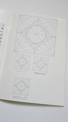
It was decided instead that a contents page with each module and some examples of shapes within the modules would be created as an effective reference for users.

Study Task 7 - Development

Name Considerations


Definitions for words associated with modular typography:

Modular 
- employing or involving a module or modules as the basis of design or construction
- relating to modulus 

Grid 
- a framework of spaced bars that are parallel to or cross each other; a grating 
- a network of lines that cross each other to form a series of squares or rectangles 

Modulus 
- another term for absolute value 
- a constant factor or ratio
- a number used as a divisor for considering numbers in sets, numbers being considered congruent when giving the same remainder when divided by a particular modulus.
- literally means 'measure' in Latin

Modules
- each of a set of standardized parts or independent units that can be used to construct a more complex structure, such as an item of furniture or a building 

Defining words around the theme of modular forms and grid structures has allowed the discovery of terms that are less obvious but still understandable. The grids have been created from one component which is then repeated to form the overall design. Modules makes reference to the starting point of all the systems making it an appropriate and concise name for the sketchbook.