Cover Design Ideas
Layout 1
The focus of this idea was on the block shapes that are created with the grids and that make up modular design. By using all of the geometric shapes that were within the grids in the book these were arranged in a rectangular format to make reference to the square quality of modular design. However it was found that when the shapes were positioned within the grid alongside each other some started to join together to form new shapes. For this design to be effective the shapes would have to be arranged in a way so that they do not merge and retain their individual forms.
Layout 2
Alternatively using just basis shapes, a square, circle and triangle, aimed to reflect the fundamentals of modular design. These shapes would form the basis of a minimalist design that would be combined with a logotype. However creating a composition of these shapes side by side was difficult because of the difference in forms. The contrast between the straight edged shapes with the circular element was particularly hard to balance. In other combinations the shapes started to join making them look like a complete shape rather than individual elements. The shapes were also placed within an outline of the grid they were in to place the shapes within a space, allowing them to look more uniform and structured.
Layout 3
Another focus was to play with the scale of the block shapes within a standard square grid. The grid would be used to place the shapes at different scales to create the cover design. When created there was intense contrast between positive and negative space because of the black fill on the shapes which is quite impactful. With this design balancing the space between shapes and background could be quite difficult. Also positioning the logotype without looking lost or overpowered could be quite hard with filled shapes.
Layout 4
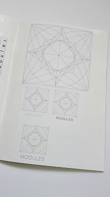
The final idea was to focus on the modules used to create the grids. The intricacy of the modules would mean that the design would be quite minimalist to avoid looking busy. Using a module from each of the grids would represent the content of the book.
Due to the odd number and amount of modules this restricted the ways in which they could be structured. Maintaining a gridded structure, thirteen blocks were best shown in a column or row however this made it difficult to then place the title without ruining the minimal design.
Creating a repeated design from the modules was considered as this could be printed onto a coloured cardstock to create a subtle background design, ontop of which a logotype could then be placed.
Repeating the column of modules created strips of each design which looked more like a fabric pattern. By alternating the order of the columns this created a more random appearance which didn't stand out as much, making it more useful as a background design.
By combining all of the modules into one this effectively represented the information in a simple and clean way making it the design that will be carried forward to the final outcome. The outside of the module was thickly outlined to reflect the independence of the module and made reference to the use of thicker lines within the grid systems.


No comments:
Post a Comment
Note: only a member of this blog may post a comment.