Branding of Eco lite
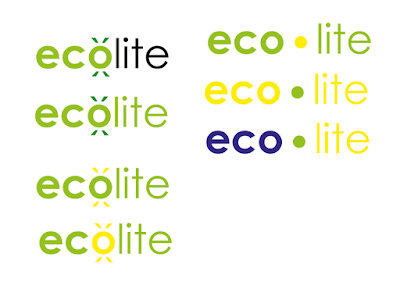
- it was considered that circular elements within ecolite could be adapted to reflect a light source, with lines used to suggest a glow or brightness
- lowercase typefaces allow the more organic shapes of the letterforms to be seen rather than having it all in capitals which can be quite square and hard.
- rounded finials and curves on the t's create a softer feel to the logotype making it feel gentler and suggests it is more friendly on the environment
- the use of the lighter typefaces create a more airy feel to the logotype and have less impact which could work well in reflecting how LEDs have a reduced effect on the environment through less pollution
- making 'eco' bold allows definition to be created between the two words without seperating them with a gap. When all in the same weight and type the word as a whole is perhaps harder to read. The bold also creates the impression of 'eco' being alight or glowing like a light bulb as it is more defined.
- making the o bold also separates the two words, whilst the circular shape could be adapted to reflect a glowing lightbulb or the earth
- reducing the size of the 'o' creates a sense of it floating in space like the earth or a lightbulb in a room however it is perhaps is less obvious that the letter is also part of the word 'eco'.
- adding a glow around the letter could create a greater impression of the circle being alight.
- it was considered that the use of the two contrasting weights in the logotype would best create distinction between the words, whilst also creating a sense of a glow in the word eco.
- The geometric nature of the letterforms create a contemporary and professional feel to the logotype which works well in reflecting the efficient qualities of the product and company.
- the use of the regular weight for 'lite' is more effective than the light version. The light version is too much of a contrast alongside the bold typeface, whilst the regular one complements the bolder typeface and creates distinction between the two words.
- outlining the word 'eco' could be used to reflect the idea of 'eco' being lit up as there is more negative space, however this perhaps does not create as much of a professional and slick looking logotype
- adding a circle between the two words could help split them up and mean that the 'o' doesn't need to be used.
- to better reflect the idea of a light bulb, outlining a circle creates the impression of a dot of white light.
- using the accents that come on the o, these were duplicated to use as lines to represent the shine of a light with the 'o' being the light source.
- these lines could perhaps be thinner and more delicate so they are more subtle.
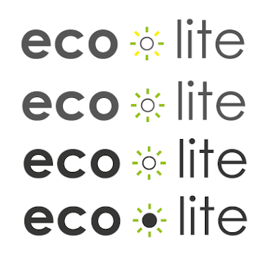
- filling the dot makes the shape more solid however is perhaps more effective at creating a sense of light when outlined as the black dot is heavier.
- adding the gradient around the 'o' looks like more of a natural fade, however looks more like a shadow than light source. This could be made more effective by using a lighter colour such as white or yellow, to reflect light better.
- Using the accents from the letters these were applied to the central dot to make this look like the light source, however because of the sharp edges of these it looks odd.
- Using the accents on the top of the 'i' aims to make the dot look likes its projecting light however it looks more like ears
- Adapting the circle in the middle to include straight lines rather than the accent lines used in the previous designs is more effective at reflecting the glow of the circle of light in the middle.
- Making the lines thinner means there is more contrast between this and the rest of the logotype and means the design does not dominate.
- The outlined circle is more effective at representing a sense of the dot being alight
- Making the gap between the circle / dot and the lines bigger helps to more clearly separate them and will make the design clearer at smaller sizes.
- These colours aim to represent different aspects of the environment, with the blues reflecting the sky, greens greenery and yellow the sun. White could similarly reflect this as well as suggesting bright light from a light bulb.
- Yellow would not be very effective on white backgrounds.
- It was considered the main colour of the logotype could be used to reflect darkness, with the dot in the middle reflecting the light bulb which is environmentally frienly and therefore green. Rather than using black, grey was considered as you can usually make out things in a dark room, therefore it is rarely pitch black, when 'dark'. Yellow could be used to suggest the dot is alight or create a sense of energy through colour, whilst green could reflect the green qualities of the bulb.
- Using the green around the circle in the middle best communicates the idea of the bulb being more environmentally friendly as people understand what green stand for. Using green only around the light bulb makes it more subtle and steers away from the classic green aesthetic of using green as a predominant colour.


No comments:
Post a Comment
Note: only a member of this blog may post a comment.