Final Design and Evaluation
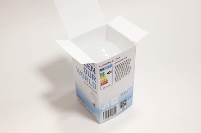
The energy saving qualities of the product are highlighted through the caption 'Save your energy' and '90% energy saver' which is the main feature of the product and therefore one of the main messages on the packaging. This is then linked to the practical consumer benefit of saving money and environmental benefits, allowing both to reinforce each other. The use of imagery reflects the reduction in pollution that occurs with the use of the product therefore further emphasising the environmental qualities more specifically.
The product dispels the myth about the product being expensive and that switching to LEDs costs alot. 'Lighten you bill' outlines how the product is cost effective in terms of energy savings in the long run which links to it value for money and suggest the switch / slightly higher outlay is worth it. The bright glow in the the image creates a sense of the bulb being bright and natural which counteracts the preconception that LEDs are not bright enough or that bulbs shine with a very white light.
The design is contemporary and modern through the use of bright colours and imagery combined with a white background which makes the design stand out, creating a fresh and clean aesthetic. The bold use of typography creates a contemporary and confident feel to the design.
The design appeals to both mainstream consumers and green consumers through imagery and text. Clear a simple messages outlines the environmental and practical benefits of the product whilst imagery reinforces the less polluting qualities of the product. The use of 'our' in 'green our world' suggests a collective responsibility making people more likely to buy the product.The product outlines how the the consumer can make an impact and easily help the environment through buying the lightbulb. The linking of practical benefits and environmental benefits, clearly outlines the results of buying / using the product, allowing consumers understand the rewards of purchasing the product.
The imagery and words are well suited in creating a positive, bright and upbeat design which people are more likely to be motivated to purchase.
The design stands out on the shelf through the use of bold, all capitalised typography and clear, short messages which speak out to the consumer. Three sides of the design have messages on them so different messages could be on display on the shelf which will encourage consumers to pick up the design and interact with it to see all the messages. The use of the words 'our' and 'your' is emotive and more personal to the consumer which they will associate with.
The design has an original approach to representing sustainability and avoids the use of cliche imagery, by not using plant imagery or the colour green which gives it a point of difference from other LED products on the market. Imagery used in other LED packaging designs often does not reflect the actual pollution reducing benefits the product has, rather just makes a general link to a greener environment. The design highlights this idea through cloud imagery which suggests a cleaner atmosphere, with the blue colour scheme used to further enhance this idea, adding to the visual of the sky.


No comments:
Post a Comment
Note: only a member of this blog may post a comment.